PCA
→ Why do it?
After RNAseq, you're left with a lot of genes to look at, and you wish someone would just tell you which are the important ones. PCA is one way of doing that. It's a method in a family known as 'dimensional reduction', where for RNAseq the dimensions are your genes. It can help guide you as to what genes are driving differences between phenotypes, but it can also be an easy method for quality assurance to make sure your samples of the same experimental group are actually grouping together.
→ How does it work?
I'll be honest: I have not wrapped my head around exactly how PCA does what it does - but I can tell you the gist, and we can interpret the results.
Your data float in N-dimensional space, where N is the number of genes you have expression for. While this number will typically range in the thousands, we can simplify for just a moment down to two genes.
With just two genes, we can represent it via an x-y plane, as shown below (first panel):
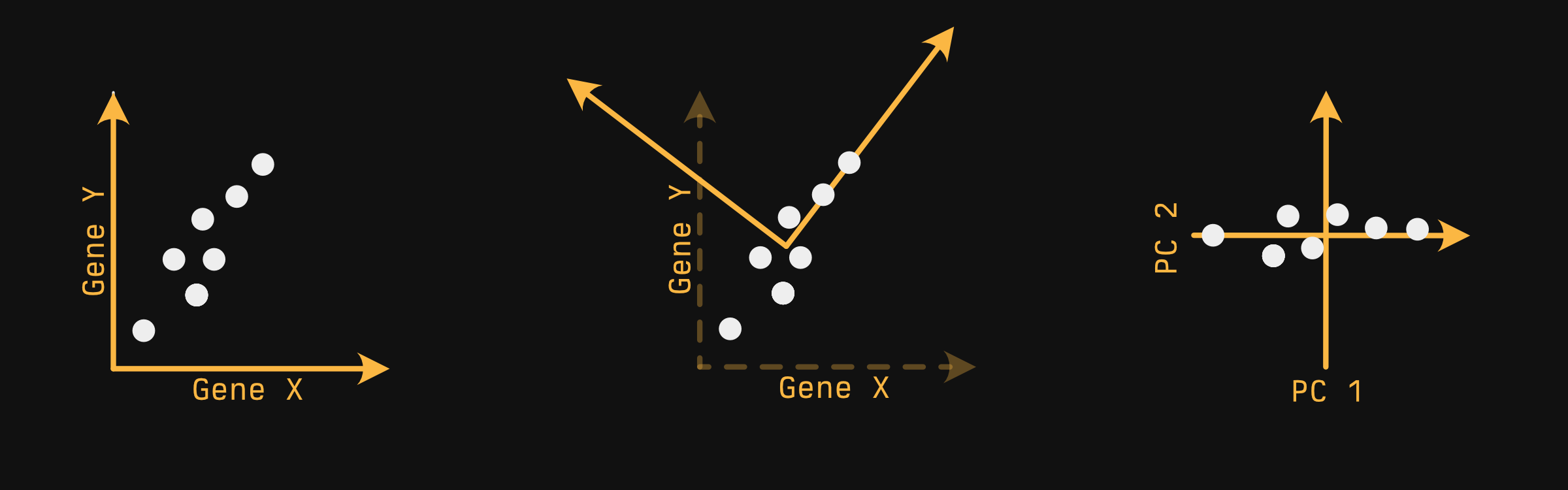
Your samples - the white circles - float in a very pedagogically convenient pattern. You can imagine PCA does something like this:
-
Find the axis in which you capture the most variability. Allison Horst described this as 'if you were a whale shark, which way would you rotate your head to get the most krill on a first pass', provided your samples were krill. In a 2-D plane, this looks a lot like fitting a line. This axis is our first principle component.
-
Next, draw a line orthogonal to the first that captures the next most variability. Since we only have two dimensions, we don't have a choice where it goes. If we had a third axis pointing out at us, we'd be able to 'spin' the second axis around the first, out of the screen and into it...but we don't.
-
After this is done for every axis, you generally choose two axes to plot, and this is typically the first and second principal components, since they capture the most variability.
Exactly HOW the PCA algorithm finds these axes is frankly beyond me.
→ Doing it
library(tidyverse)
library(broom)
library(ggsci)
library(ggrepel)
library(cellebrate)
library(DESeq2)

options(crayon.enabled = FALSE) # Keeps formatting pretty for the website.
Another way: tidymodels
You can also perform PCA with tidymodels - it's a bit neater, but woefully more involved if you aren't already familiar with it. If you do any supervised analyses, it may be worth learning the tidymodels ecosystem.→ Penguins
→ Preparing the dataset
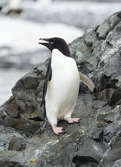
Instead of starting with RNAseq data - with its thousands of genes - let's start with something a bit easier and (most importantly) cuter. We're going to use the penguins dataset, which has recently been introduced into base R.
What about `iris`?
If you're familiar with typical R examples, you might be used to seeing the iris dataset - it contains various measurements of flowers of various species, and lets you see how various properties of the flowers can, in combination, be used to classify flower species.
There are a couple reasons for using the penguins dataset instead. First of all, penguins are cute:
Secondly, the dataset does have some ties with eugenics in that although it was not collected by RA Fisher, it was used by him for a paper on linear discriminant analysis, published in the Journal of Eugenics. The dataset is somewhat tainted by association, and since we have another dataset available to us, why not use it?
The penguins data have some missing values, which will cause problems for us later if not removed. complete.cases returns a vector of TRUE and FALSE (that is, a 'logical vector'), TRUE if every value in the row is not NA, FALSE otherwise. We use that to select 'complete' rows.
penguins_no_na <- penguins[complete.cases(penguins), ] |>
  as_tibble()

penguins_no_na
# A tibble: 333 × 8
   species island    bill_len bill_dep flipper_len body_mass sex     year
   <fct>   <fct>        <dbl>    <dbl>       <int>     <int> <fct>  <int>
 1 Adelie  Torgersen     39.1     18.7         181      3750 male    2007
 2 Adelie  Torgersen     39.5     17.4         186      3800 female  2007
 3 Adelie  Torgersen     40.3     18           195      3250 female  2007
 4 Adelie  Torgersen     36.7     19.3         193      3450 female  2007
 5 Adelie  Torgersen     39.3     20.6         190      3650 male    2007
 6 Adelie  Torgersen     38.9     17.8         181      3625 female  2007
 7 Adelie  Torgersen     39.2     19.6         195      4675 male    2007
 8 Adelie  Torgersen     41.1     17.6         182      3200 female  2007
 9 Adelie  Torgersen     38.6     21.2         191      3800 male    2007
10 Adelie  Torgersen     34.6     21.1         198      4400 male    2007
# ℹ 323 more rows
# ℹ Use `print(n = ...)` to see more rows
PCA is generally only done on continuous numeric variables, so let's select those:
penguins_minimal <- penguins_no_na |>
  select(bill_len, bill_dep, flipper_len, body_mass)
penguins_minimal
# A tibble: 333 × 4
   bill_len bill_dep flipper_len body_mass
      <dbl>    <dbl>       <int>     <int>
 1     39.1     18.7         181      3750
 2     39.5     17.4         186      3800
 3     40.3     18           195      3250
 4     36.7     19.3         193      3450
 5     39.3     20.6         190      3650
 6     38.9     17.8         181      3625
 7     39.2     19.6         195      4675
 8     41.1     17.6         182      3200
 9     38.6     21.2         191      3800
10     34.6     21.1         198      4400
# ℹ 323 more rows
# ℹ Use `print(n = ...)` to see more rows
→ Doing PCA
There are actually two PCA functions built in to R: prcomp and princomp. You should use prcomp. They're both essentially the same, but prcomp is slightly more numerically accurate. This generally won't matter for your purposes, but there's really no reason not to use it.
In general, you should scale (standardize, 'z-scorify') your data, but it's off by default (for compatibility with S, the language which R is derived/modeled after). For the same reasons as with hierarchical clustering, it probably makes sense to scale your log'd expression data, too.
Actually doing PCA is R is stupid easy:
pca <- prcomp(penguins_minimal, scale. = TRUE)
pca
Standard deviations (1, .., p=4):
[1] 1.6569115 0.8821095 0.6071594 0.3284579

Rotation (n x k) = (4 x 4):
                   PC1         PC2        PC3        PC4
bill_len     0.4537532 -0.60019490 -0.6424951  0.1451695
bill_dep    -0.3990472 -0.79616951  0.4258004 -0.1599044
flipper_len  0.5768250 -0.00578817  0.2360952 -0.7819837
body_mass    0.5496747 -0.07646366  0.5917374  0.5846861
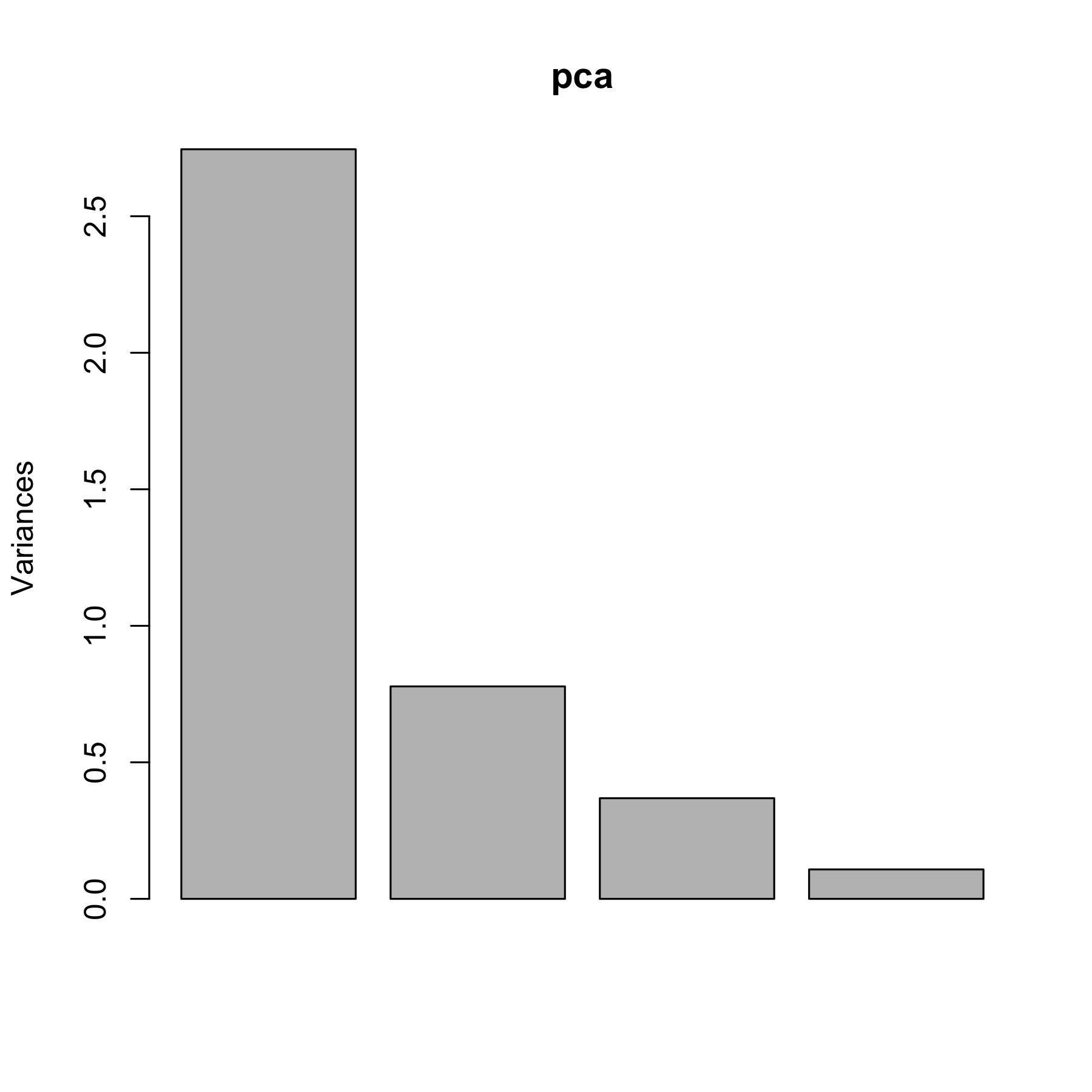
→ Scree plot
You'll notice we have 4 principal components (PC1-4). This is because we had 4 input variables: bill_len, bill_dep, flipper_len, and body_mass. The order of the components is important - the first captures the most variability, the second the second most, and so on. We can observe this more directly with a 'scree plot'.
The venerable broom package will allow us to get at these data painlessly with the tidy function:
var_explained <- tidy(pca, "pcs")
var_explained
# A tibble: 4 × 4
     PC std.dev percent cumulative
  <dbl>   <dbl>   <dbl>      <dbl>
1     1   1.66   0.686       0.686
2     2   0.882  0.195       0.881
3     3   0.607  0.0922      0.973
4     4   0.328  0.0270      1
Which we can easily plot:
ggplot(var_explained, aes(PC, percent)) +
  geom_line() +
  theme_minimal() +
  coord_cartesian(ylim = c(0, 1)) +
  labs(y = "Variance explained")
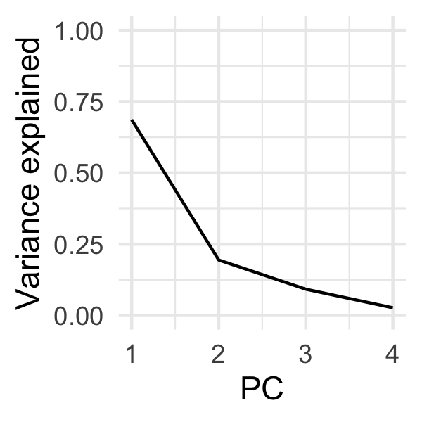
Scree plots are typically used for determining how many components you would need to capture the brunt of the variability before you start getting diminishing returns. This is typically denoted by a qualitative 'crook' or a 'knee' in the plot. We can kind of see one at PC2, but as we'll see later, PC3 is actually quite valuable for discriminating penguin species.
→ PCA plot
If we want to plot our penguins in principal component space, we need to extract a different slot from our PCA object.
penguin_coords <- pca |>
  tidy("samples")

penguin_coords
# A tibble: 1,332 × 3
     row    PC   value
   <int> <dbl>   <dbl>
 1     1     1 -1.85
 2     1     2 -0.0320
 3     1     3  0.235
 4     1     4  0.528
 5     2     1 -1.31
 6     2     2  0.443
 7     2     3  0.0274
 8     2     4  0.401
 9     3     1 -1.37
10     3     2  0.161
# ℹ 1,322 more rows
# ℹ Use `print(n = ...)` to see more rows
Since I want to plot different PCs on different axes, and since ggplot2 generally expects different axes to be different columns, I'm going to make this dataset 'wider':
penguin_coords <- pivot_wider(
  penguin_coords,
  names_from = PC,
  names_prefix = "PC",
  values_from = value
)

penguin_coords
# A tibble: 333 × 5
     row    PC1     PC2     PC3    PC4
   <int>  <dbl>   <dbl>   <dbl>  <dbl>
 1     1 -1.85  -0.0320  0.235   0.528
 2     2 -1.31   0.443   0.0274  0.401
 3     3 -1.37   0.161  -0.189  -0.528
 4     4 -1.88   0.0123  0.628  -0.472
 5     5 -1.92  -0.816   0.700  -0.196
 6     6 -1.77   0.366  -0.0284  0.505
 7     7 -0.817 -0.500   1.33    0.348
 8     8 -1.80   0.245  -0.626   0.215
 9     9 -1.95  -0.997   1.04   -0.210
10    10 -1.57  -0.577   2.05   -0.263
# ℹ 323 more rows
# ℹ Use `print(n = ...)` to see more rows
I included the names_prefix parameter because otherwise the columns would be numbers. This is technically workable when you use a tibble, but confusing: when plotting with ggplot, I would need to remember to do ggplot(data, aes(`1`, `2`)) instead of ggplot(data, aes(1, 2)), which would not work. I already burned myself once doing this just writing this chapter, so to save you the pain, I'm showing you how to sidestep it.
You'll notice our data doesn't have any information on the penguins - what species they are, for instance. For that, we have to join them back to our original data. The safest way to do this is to 'join' our data, rather than just blindly abutting our data next to one another. This protects against the case in which rows are missing or moved.
The row column of our penguin_coords includes the rownames of our input data. To easily join these data together, we can convert our rownames of our original data into a column, then join based on that column:
penguins_with_rownames <- penguins_no_na |>
  rownames_to_column("row") |>
  mutate(row = as.numeric(row)) # To make same type as penguin_coords$row

penguins_with_pca_coords <- left_join(
  penguins_with_rownames,
  penguin_coords,
  by = "row"
)

glimpse(penguins_with_pca_coords)
Rows: 333
Columns: 13
$ row         <dbl> 1, 2, 3, 4, 5, 6, 7, 8, 9, 10, 11, 12, 13, 14, 15, 16, 17,…
$ species     <fct> Adelie, Adelie, Adelie, Adelie, Adelie, Adelie, Adelie, Ad…
$ island      <fct> Torgersen, Torgersen, Torgersen, Torgersen, Torgersen, Tor…
$ bill_len    <dbl> 39.1, 39.5, 40.3, 36.7, 39.3, 38.9, 39.2, 41.1, 38.6, 34.6…
$ bill_dep    <dbl> 18.7, 17.4, 18.0, 19.3, 20.6, 17.8, 19.6, 17.6, 21.2, 21.1…
$ flipper_len <int> 181, 186, 195, 193, 190, 181, 195, 182, 191, 198, 185, 195…
$ body_mass   <int> 3750, 3800, 3250, 3450, 3650, 3625, 4675, 3200, 3800, 4400…
$ sex         <fct> male, female, female, female, male, female, male, female, …
$ year        <int> 2007, 2007, 2007, 2007, 2007, 2007, 2007, 2007, 2007, 2007…
$ PC1         <dbl> -1.8508078, -1.3142762, -1.3745366, -1.8824555, -1.9170957…
$ PC2         <dbl> -0.03202119, 0.44286031, 0.16098821, 0.01233268, -0.816369…
$ PC3         <dbl> 0.23454869, 0.02742880, -0.18940423, 0.62792772, 0.6999979…
$ PC4         <dbl> 0.527602641, 0.401122984, -0.527867518, -0.472182619, -0.1…
We have enough for a basic plot - let's do so:
ggplot(penguins_with_pca_coords, aes(PC1, PC2)) +
  geom_point(aes(color = species)) +
  theme_minimal() +
  scale_color_nejm() +
  labs(color = "Species") +
  theme(legend.position = "bottom")
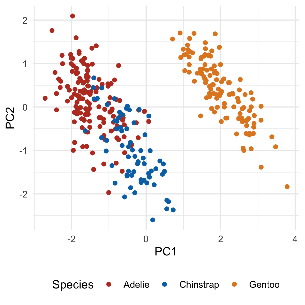
Our first principle component clearly separates Gento from Adelie and Chinstrap. You might be able to surmise what variables are causing this based on the original PCA output, but we'll make this crystal clear when we add our loadings. But first, let's plot PC2 and PC3:
ggplot(penguins_with_pca_coords, aes(PC2, PC3)) +
  geom_point(aes(color = species)) +
  theme_minimal() +
  scale_color_nejm() +
  labs(color = "Species") +
  theme(legend.position = "bottom")
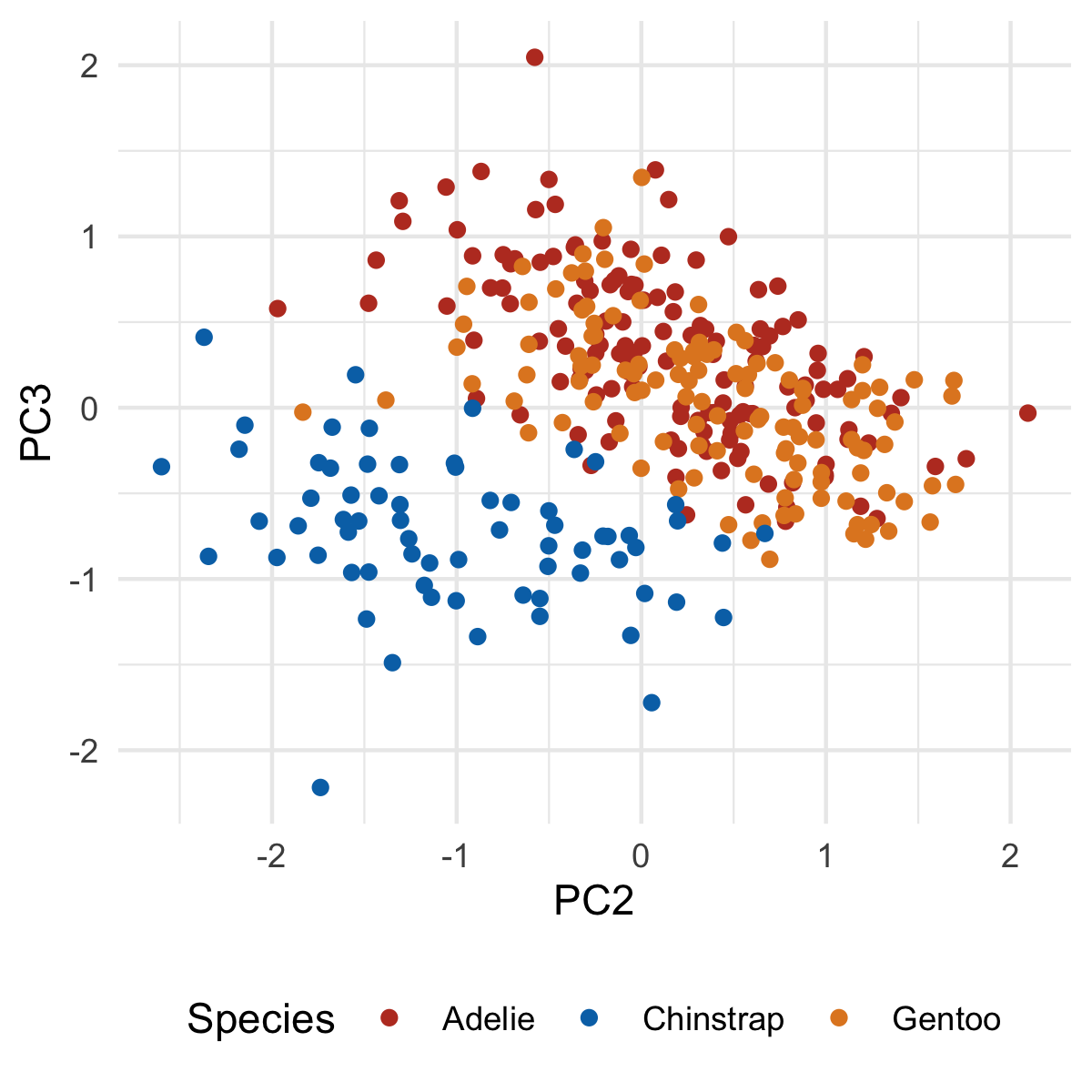
Notice how the third principal component helps separate Chinstrap from everyone else, something that was not seen in the first two principal components.
→ Biplot
Sometimes you'll see a PCA plot with arrows overlaid that represent the 'old' axes (that is, the variables within our dataset before PCA). These are useful as they can let you know why a given group separates from one another in terms of the variables you care about, rather than principal components. These plots are called 'biplots'.
→ Doing it badly
To get the directionality of these old axes in the new plane, we need to extract the loadings from our PCA. Again we turn to tidy:
penguin_loadings <- tidy(pca, "loadings")
penguin_loadings
# A tibble: 16 × 3
   column         PC    value
   <chr>       <dbl>    <dbl>
 1 bill_len        1  0.454
 2 bill_len        2 -0.600
 3 bill_len        3 -0.642
 4 bill_len        4  0.145
 5 bill_dep        1 -0.399
 6 bill_dep        2 -0.796
 7 bill_dep        3  0.426
 8 bill_dep        4 -0.160
 9 flipper_len     1  0.577
10 flipper_len     2 -0.00579
11 flipper_len     3  0.236
12 flipper_len     4 -0.782
13 body_mass       1  0.550
14 body_mass       2 -0.0765
15 body_mass       3  0.592
16 body_mass       4  0.585
As before, we'll widen our data:
penguin_loadings_wide <- pivot_wider(
  penguin_loadings,
  names_from = PC,
  values_from = value,
  names_prefix = "PC"
)
penguin_loadings_wide
# A tibble: 4 × 5
  column         PC1      PC2    PC3    PC4
  <chr>        <dbl>    <dbl>  <dbl>  <dbl>
1 bill_len     0.454 -0.600   -0.642  0.145
2 bill_dep    -0.399 -0.796    0.426 -0.160
3 flipper_len  0.577 -0.00579  0.236 -0.782
4 body_mass    0.550 -0.0765   0.592  0.585
Each row represents the coordinates of an axis in 'PCA space'. Each of these axes is one unit long.
Plotting them isn't hard:
ggplot(penguins_with_pca_coords, aes(PC1, PC2)) +
  geom_point(aes(color = species)) +
  geom_segment(
    data = penguin_loadings_wide,
    aes(x = 0, y = 0, xend = PC1, yend =  PC2),
    arrow = arrow(),
  ) +
  geom_text(
    data = penguin_loadings_wide,
    aes(x = PC1/2, y= PC2/2, label = column)
  ) +
  theme_minimal() +
  scale_color_nejm() +
  labs(color = "Species") +
  theme(legend.position = "bottom")
→ Making it better
This clearly looks bad. Everything we want is there but it's all messed up. However, I wanted to show you the 'bones' of the code before I did anything fancy, so you can associate what code goes with what changes.
I'm going to make a few changes:
- Shrink the arrowheads
- Make the arrows grayer
- Increase the distance of the arrowheads by scaling the magnitude by a constant
The last step will increase ALL arrows by a factor, so their differences can still be compared. They'll no longer be unit vectors, but I've found that rarely to be useful or important.
ggplot(penguins_with_pca_coords, aes(PC1, PC2)) +
  geom_point(aes(color = species)) +
  geom_segment(
    data = penguin_loadings_wide,
    aes(
      x = 0, y = 0,
      xend = PC1 * 3,
      yend = PC2 * 3
    ),
    arrow = arrow(length = unit(0.02, "npc")), # Change 1
    color = "gray40"                           # Change 2
  ) +
  geom_text(
    data = penguin_loadings_wide,
    aes(
      x = PC1 * 3 / 2,
      y= PC2 * 3 / 2,
      label = column
    )
  ) +
  theme_minimal() +
  scale_color_nejm() +
  labs(color = "Species") +
  theme(legend.position = "bottom")

There's one additional thing we can do to keep the labels from overlapping, using the ggrepel package. In general, this is as simple as loading the package and converting geom_text to geom_text_repel:
library(ggrepel)

ggplot(penguins_with_pca_coords, aes(PC1, PC2)) +
  geom_point(aes(color = species)) +
  geom_segment(
    data = penguin_loadings_wide,
    aes(
      x = 0, y = 0,
      xend = PC1 * 3,
      yend = PC2 * 3
    ),
    arrow = arrow(length = unit(0.02, "npc")), # Change 1
    color = "gray40"                           # Change 2
  ) +
  geom_text_repel(
    data = penguin_loadings_wide,
    aes(
      x = PC1 * 3 / 2,
      y= PC2 * 3 / 2,
      label = column
    ),
    min.segment.length = 0
  ) +
  theme_minimal() +
  scale_color_nejm() +
  labs(color = "Species") +
  theme(legend.position = "bottom")
I also added min.segment.length = 0 so that the labels will always point to where they intended to be. It's a little less tidy looking, but also a little less ambiguous.
→ What's it all mean?
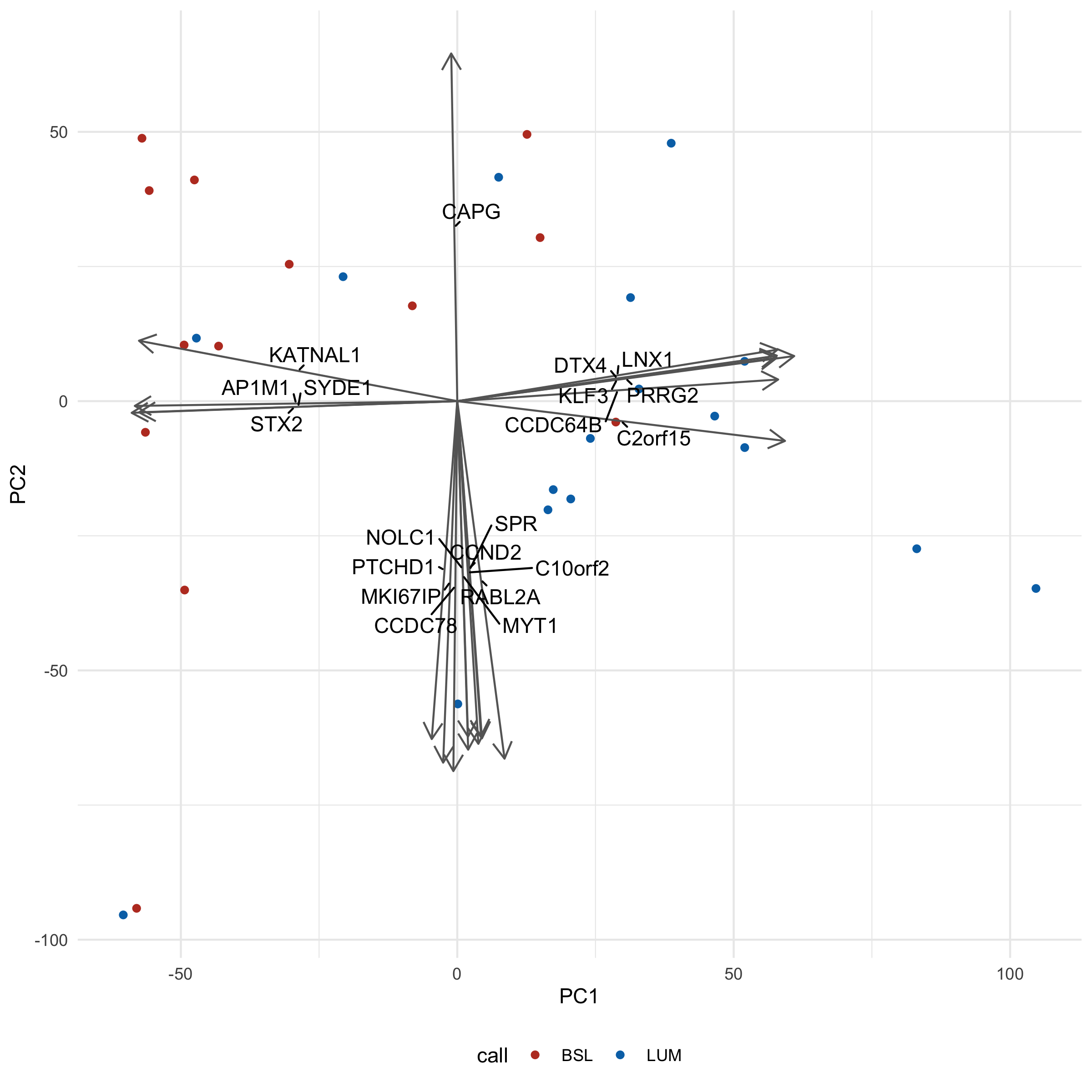
Let's take a look at what these loadings imply for a second. flipper_len and body_mass is pointing towards Gentoo, and indeed, Gentoo penguins are relatively huge. We also note that bill_len appears to be pointing along the Adelie/Chinstrap gradient, implying that it will be an important determinant for separating the two groups. Indeed, when we plot across PC2 and PC3 we see just that:
library(ggrepel)

ggplot(penguins_with_pca_coords, aes(PC2, PC3)) +
  geom_point(aes(color = species)) +
  geom_segment(
    data = penguin_loadings_wide,
    aes(
      x = 0, y = 0,
      xend = PC2 * 3,
      yend = PC3 * 3
    ),
    arrow = arrow(length = unit(0.02, "npc")),
    color = "gray40"
  ) +
  geom_text_repel(
    data = penguin_loadings_wide,
    aes(
      x = PC2 * 3 / 2,
      y= PC3 * 3 / 2,
      label = column
    ),
    min.segment.length = 0
  ) +
  theme_minimal() +
  scale_color_nejm() +
  labs(color = "Species") +
  theme(legend.position = "bottom")
→ Make it a function
Before we move on to biological data, let's turn this into a function that we can apply to both our penguins and cell data.
One tricky aspect of making this function is that we want to include which principal component columns we choose to plot as some of our arguments. However, if we did something like this:
my_plot_function <- function(data, x, y) {
  ggplot(data, aes(x, y)) +
    geom_point()
}
...this would actually fail:
my_plot_function(penguins_with_pca_coords, PC1, PC2)
# Error in `geom_point()`:
# ! Problem while computing aesthetics.
# ℹ Error occurred in the 1st layer.
# Caused by error:
# ! object 'PC1' not found
# Run `rlang::last_trace()` to see where the error occurred.
The reasons for this are complex. For the curious, the answer is explained best here. Essentially, you need to 'smuggle' the arguments in and evaluate them at the right time and place. This is done via 'embracing', using {{. This WILL work:
my_fixed_plot_function <- function(data, x, y) {
  ggplot(data, aes({{ x }}, {{ y }})) +
    geom_point()
}
my_fixed_plot_function(penguins_with_pca_coords, PC1, PC2)
Applying this to our old plots, we can make a function like this:
plot_pca <- function(data, x, y, color_column, loadings, loadings_scale_factor) {
  ggplot(data, aes({{ x }}, {{ y }})) +
    geom_point(aes(color = {{ color_column }})) +
    geom_segment(
      data = loadings,
      aes(
        x = 0, y = 0,
        xend = {{ x }} * loadings_scale_factor,
        yend = {{ y }} * loadings_scale_factor
      ),
      arrow = arrow(length = unit(0.02, "npc")),
      color = "gray40"
    ) +
    geom_text_repel(
      data = loadings,
      aes(
        x = {{ x }} * loadings_scale_factor / 2,
        y = {{ y }} * loadings_scale_factor / 2,
        label = column
      ),
      min.segment.length = 0,
      max.overlaps = 20
    ) +
    theme_minimal() +
    scale_color_nejm() +
    theme(legend.position = "bottom")
}

plot_pca(penguins_with_pca_coords, PC1, PC2, species, penguin_loadings_wide, 3)

The code inside the body of the function isn't much different from the code we used to make PCA plots previously:
-
I factored out the columns that determine the x and y axes and color (using the embrace (
{{) operator), - I've made the loadings dataset a parameter
-
I added a
loadings_scale_factorparameter. We want to be able to adjust this easily since with different datasets, the amount we need to 'expand' our loadings varies wildly (we'll see this in the next section)
→ Biological Data
With gene expression data you will have as many loading arrows as you have genes. Obviously you can't plot all these - it would be a mess - so we should filter for the loadings that have the largest magnitude in the directions we're interested in.
filter_loadings <- function(loadings, PC_A, PC_B, n) {
  # This function keeps the largest n magnitude loadings for both PCs

  # It may return  < 2*n loadings if both PCs 'pick' the same loading

  # This is kind of a clunky bit of code, but I can't think of a better way.
  loadings |>
    arrange(abs({{ PC_A }})) |>
    mutate(keep1 = rep(c(F, T), times = c(nrow(loadings) - n, n))) |>
    arrange(abs({{ PC_B }})) |>
    mutate(keep2 = rep(c(F, T), times = c(nrow(loadings) - n, n))) |>
    filter(keep1 | keep2) |>
    select(-keep1, -keep2)
}

filter_loadings(penguin_loadings_wide, PC1, PC2, 1)
# A tibble: 2 × 5
  column         PC1      PC2   PC3    PC4
  <chr>        <dbl>    <dbl> <dbl>  <dbl>
1 flipper_len  0.577 -0.00579 0.236 -0.782
2 bill_dep    -0.399 -0.796   0.426 -0.160
Instead of adding all our loadings to the plotting function we made, we'll supply this filtered version instead.
Let's crack open our bladder cancer data yet again:
norm_expression_mat <- cell_rna |>
  vst() |>
  assay()
You'll want to put 'cases' as the rows. For our penguins, each row was a penguin. In its default state, each row for gene expression data is usually a gene not a sample, the unit of information we probably actually want to plot. If you forget this, you will end up with a plot that has thousands of points and you will know exactly what happened.
As such, we need to transpose our data before performing PCA:
expression_t <- t(norm_expression_mat)

cell_pca <- prcomp(expression_t, scale. = TRUE)

cell_pca_coordinates <- tidy(cell_pca) |>
  pivot_wider(names_from = PC, values_from = value, names_prefix = "PC")

glimpse(cell_pca_coordinates, width = 80)
Rows: 30
Columns: 31
$ row  <chr> "1A6", "253JP", "5637", "BV", "HT1197", "HT1376", "J82", "RT112",…
$ PC1  <dbl> -30.4016292, -58.0065914, -8.1335313, -60.4156153, 12.6108078, 7.…
$ PC2  <dbl> 25.422972, -94.171977, 17.701357, -95.397621, 49.532125, 41.57211…
$ PC3  <dbl> -34.7859242, 11.3884243, 10.8426700, -5.0198760, -12.5433371, -14…
$ PC4  <dbl> 36.4225319, -31.6204152, 17.5611424, -14.0397713, -78.3832224, -5…
$ PC5  <dbl> -19.642001, 44.477496, -3.017162, 42.059930, -40.303520, 28.25040…
$ PC6  <dbl> 8.368505, 49.212232, -17.330220, 27.888599, 4.533926, 1.268254, 1…
$ PC7  <dbl> -17.8911448, -1.8845112, -14.1458187, -0.7710756, 78.3709353, 16.…
$ PC8  <dbl> 27.3671786, -11.4932896, 42.6486138, -22.3213518, -38.4741319, -4…
$ PC9  <dbl> -56.7361483, -28.1344320, -51.7406404, -18.5778316, -48.3198031, …
$ PC10 <dbl> -17.7075529, 3.4238317, -31.8406325, 1.3956879, 3.9090899, -31.66…
$ PC11 <dbl> 9.6226812, 1.6364261, -1.3693397, -5.0885048, 4.3576782, 8.537502…
$ PC12 <dbl> 23.8847443, -7.8611541, 27.8736451, 17.7834193, -8.5471293, 32.20…
$ PC13 <dbl> 27.0640293, 0.2385481, 13.1363628, 5.1689289, 15.4297454, 10.3767…
$ PC14 <dbl> 13.5280527, -1.7371398, 1.8211620, -4.4539946, -36.2292842, 84.05…
$ PC15 <dbl> -27.196216, -11.263094, -20.157926, 5.136542, 16.441383, -9.81334…
$ PC16 <dbl> -14.588707, -7.122114, 13.635063, 15.501592, 15.353886, -6.486275…
$ PC17 <dbl> -12.280303, -13.755056, -3.346803, 3.534963, -16.665870, 23.77536…
$ PC18 <dbl> 0.9971822, -5.5524044, 13.7704522, -10.1022629, -5.4025588, 19.40…
$ PC19 <dbl> 19.2977995, -6.8518302, 3.2161952, 1.2270500, 19.0531323, -19.101…
$ PC20 <dbl> 8.0045187, 6.0505044, 0.5478513, -5.3040131, -12.9695349, 2.32992…
$ PC21 <dbl> -24.47504766, 11.83423626, -13.72046315, -12.52451891, 0.02440866…
$ PC22 <dbl> -13.9249794, 13.8372928, -1.0101539, -11.4612989, -0.5870471, -5.…
$ PC23 <dbl> 10.916880, -11.924624, -3.024771, 14.938580, 2.390969, 3.417330, …
$ PC24 <dbl> 19.8599398, -13.8228683, -23.4916323, 12.3353783, -2.8490657, 0.8…
$ PC25 <dbl> 3.6609106, 46.0697855, 10.6853402, -48.0530521, 1.3379030, 2.8025…
$ PC26 <dbl> 4.39734493, 15.94679083, 1.04179343, -19.41591581, -3.16765954, 2…
$ PC27 <dbl> 1.0991013, -15.1101868, 2.2419781, 18.6521758, 2.3587801, 1.41629…
$ PC28 <dbl> -9.52773211, -18.95387462, 15.07059417, 23.46713890, -2.30987854,…
$ PC29 <dbl> 41.5990398, 2.7744147, -52.1167153, -3.3138596, -0.8312010, 0.636…
$ PC30 <dbl> 8.619078e-13, 9.019729e-13, 8.957583e-13, 9.126588e-13, 8.833212e…
You'll notice that there are only 30 principal components, despite having thousands upon thousands of genes available to us. This is confusing! The reason is that any N samples can be described with N - 1 dimensions. Two dots can be described with a line (the first dimension), three dots can be described with a plane (the third dimension), etc. You'll also note that this has N principal components, NOT N - 1 principal components. I genuinely have no idea why this is, but the last component is usually negligible when considering variance explained.
Despite only having 30 principal components, each principal component is still a goulash of thousands of genes (our loadings) - note how each column is made of thousands of rows:
cell_loadings <- tidy(cell_pca, "loadings") |>
  pivot_wider(names_from = PC, values_from = value, names_prefix = "PC")

# Only showing the first few components
cell_loadings[1:5]
# A tibble: 18,548 × 5
   column        PC1      PC2       PC3       PC4
   <chr>       <dbl>    <dbl>     <dbl>     <dbl>
 1 TSPAN6    0.0127  -0.00592 -0.000133 -0.000978
 2 TNMD      0.00164  0.00269  0.000569 -0.00667
 3 DPM1     -0.00267  0.00242  0.00677  -0.00493
 4 SCYL3     0.0150   0.00290  0.00503  -0.000751
 5 C1orf112 -0.00925  0.0101  -0.00640  -0.00517
 6 FGR       0.0139  -0.00150  0.00243   0.00911
 7 CFH       0.0131  -0.00149  0.00411   0.0109
 8 FUCA2    -0.00817  0.00660  0.00135  -0.000318
 9 GCLC      0.0146  -0.00618 -0.00112   0.00917
10 NFYA      0.0103  -0.00331  0.00191   0.00511
# ℹ 18,538 more rows
# ℹ Use `print(n = ...)` to see more rows
We can join our cell PCA back with its metadata by doing the same trick we did with our penguins data, but using the colData of our cell_rna DESeqDataSet instead. Note that we need to convert it to a tibble first:
col_data <- colData(cell_rna) |>
  as_tibble(rownames = "row")

cell_pca_with_col_data <- left_join(col_data, cell_pca_coordinates, by = "row")
And we can use our handy functions to plot relatively painlessly:
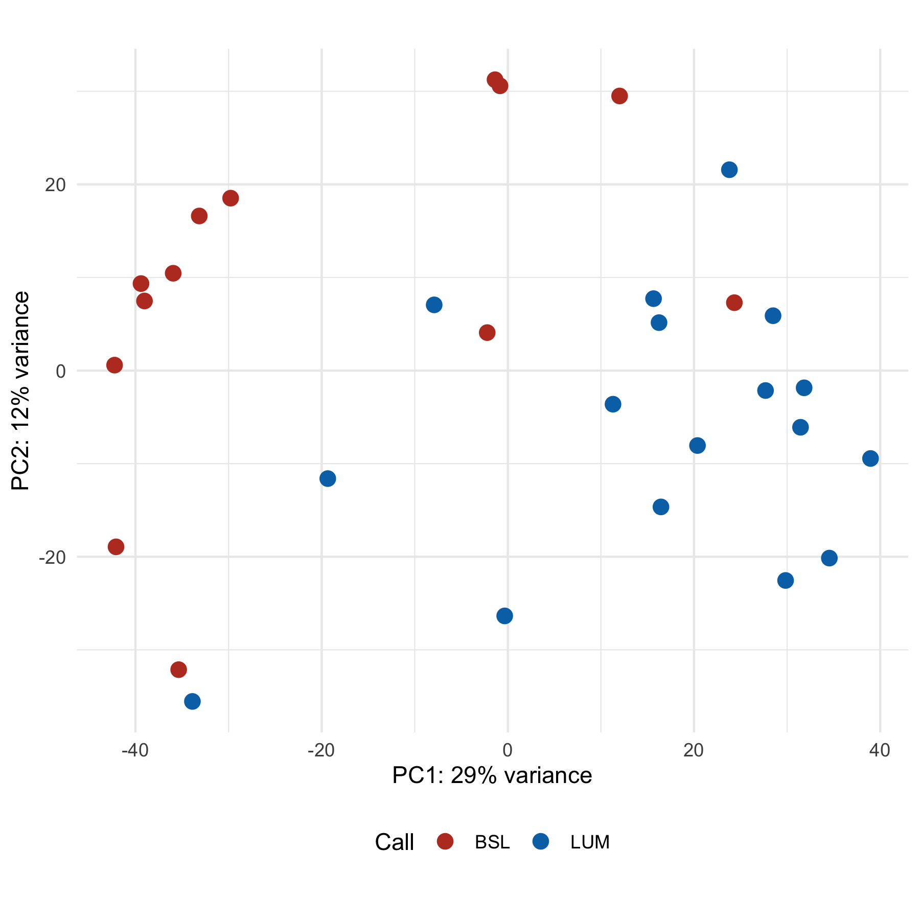
filtered_loadings <- filter_loadings(cell_loadings, PC1, PC2, 10)
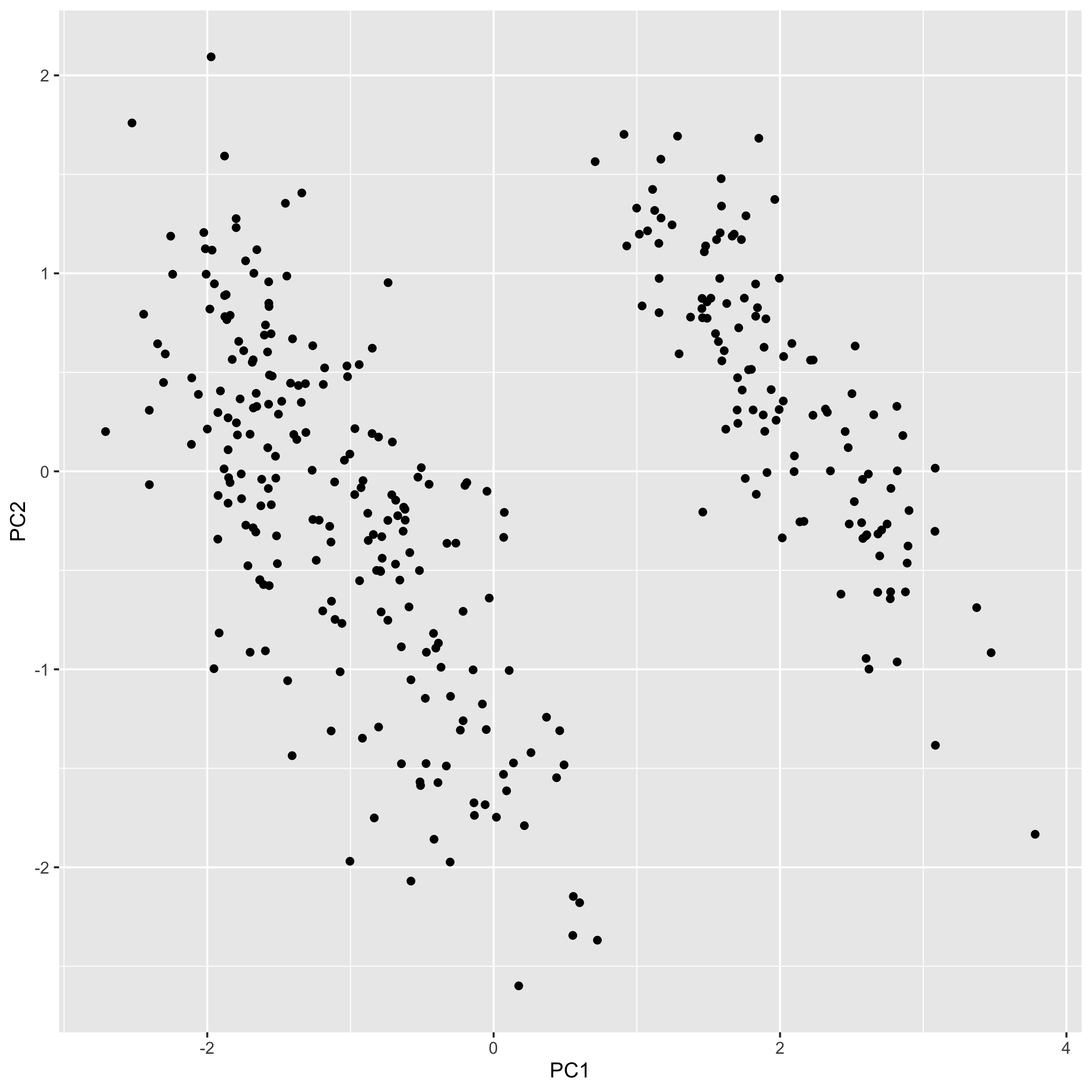
plot_pca(cell_pca_with_col_data, PC1, PC2, call, filtered_loadings, 3000)
You'll notice we had to crank up our loadings_scale_factor argument wayyy up (3000) - otherwise the arrows would be so small all you would see is the arrowheads.
Interpretation-wise, you'll note that there aren't really 'clusters' - more of a smear of dots. This might be more representative of biology itself, a gradient of a phenotype rather than distinct groups. We could validate with some kind of functional readout, like migration/invasion assays (good luck, those things are finicky).
An additional complication is that both the call and clade (which we've seen in the hclust chapter) are created based on gene expression data, so we're kind of cheating here. It would be more interesting to instead overlay some kind of phenotype, like IC50 to a drug, or, again, migration rate, and see if the 'gradient' pattern remains.
Making a scree plot, we also note that there isn't any readily apparent 'knee', and all PCs contribute relatively little:
var_explained <- tidy(cell_pca, "pcs")
ggplot(var_explained, aes(PC, percent)) +
  geom_line() +
  theme_minimal() +
  coord_cartesian(ylim = c(0, 1)) +
  labs(x = "PC", y = "Variance explained")
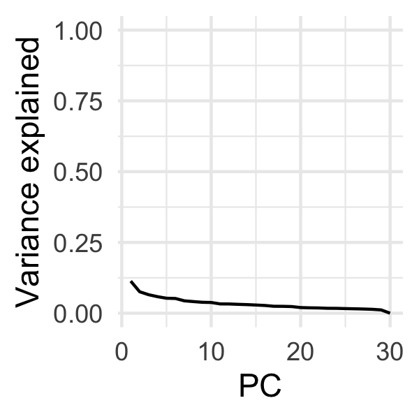
(Maybe a little knee at PC2?)
If our overlaid variable was an experimentally observed migration_rate rather than call, I would perhaps be inclined to experimentally determine if modulating those genes could influence migration, or perhaps impute the transcription factor for those genes (you could use GSVA + the C3 collection, for instance).
→ Other ways
I've shown you ways to make PCA plots that provide you with a reasonable amount of control, but there exist other, easier, but less flexible ways to do the same thing.
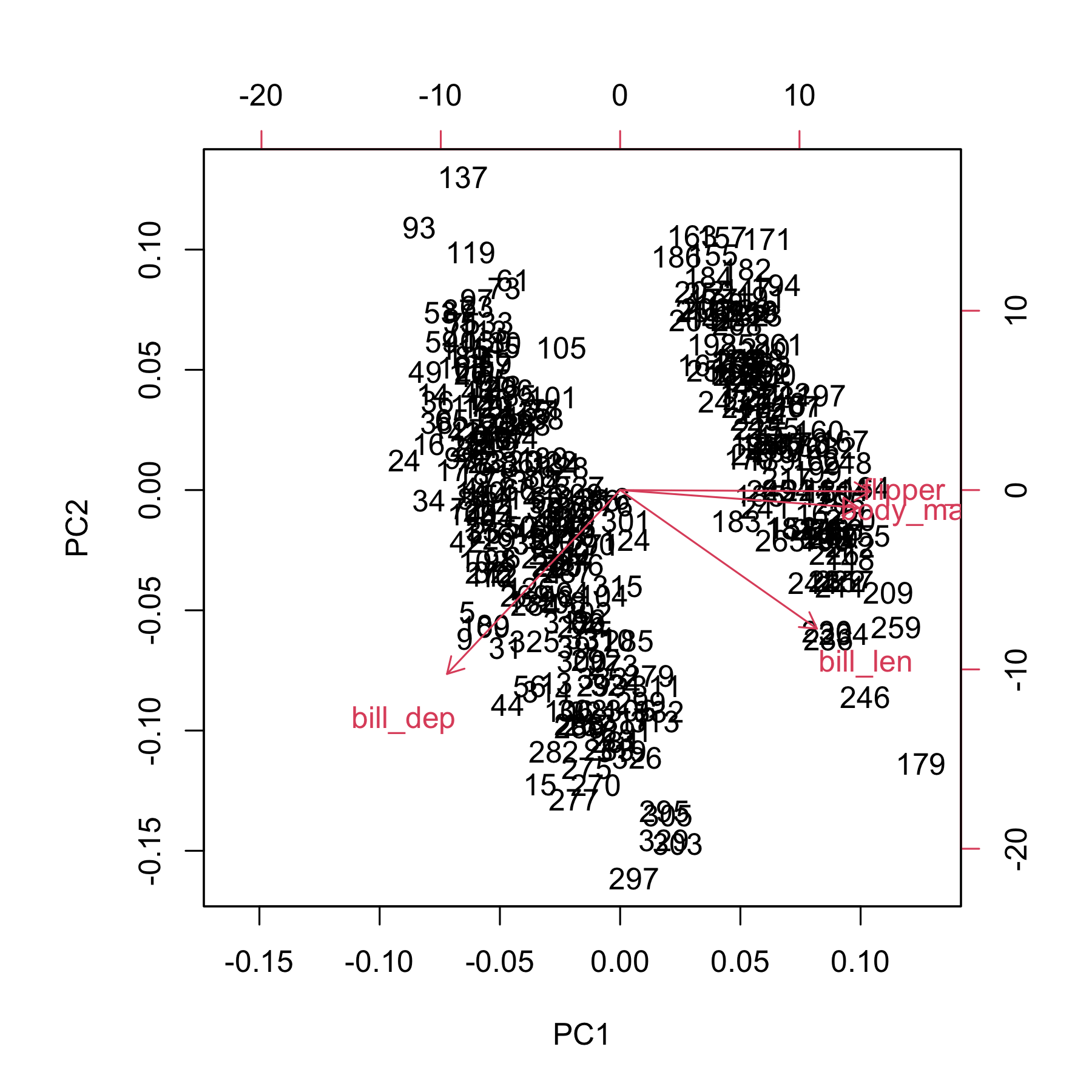
Base R has the `biplot` and `screeplot` functions:
biplot(pca)
screeplot(pca)
DESeq2 also has a built-in plotPCA function you can use. It must be on a DESeqTransform object, which are the things that come out of functions like vst and rlog.
transformed <- vst(cell_rna)
plotPCA(transformed, intgroup = "call", pcsToUse = 1:2)
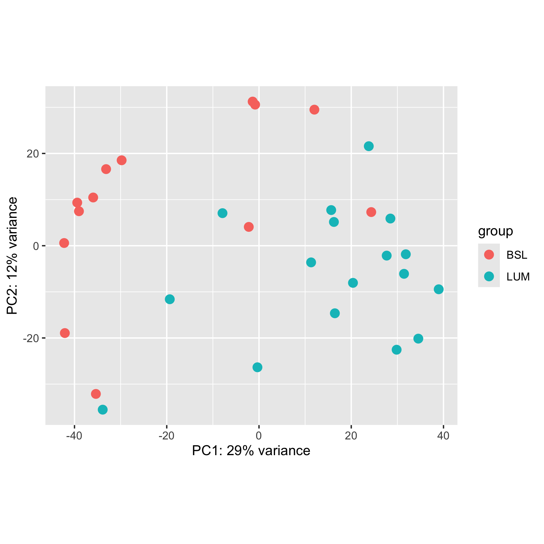
Plus, since it returns a ggplot, we can modify it to some extent:
plotPCA(transformed, intgroup = "call", pcsToUse = 1:2) +
  theme_minimal() +
  theme(legend.position = "bottom") +
  labs(color = "Call") +
  scale_color_nejm()
By default, plotPCA only uses the top 500 highest variance genes, so the results you get from a standard PCA plot will likely look different unless you set ntop = Inf. Note how this plot looks different from the ones above.
One nice feature is that you can force it to return data rather than a plot, so you can be in control of the plotting:
plotPCA(transformed, intgroup = "call", pcsToUse = 1:2, returnData = TRUE) |>
  # It returns all the colData columns - thinning up the return value for
  # display purposes
  select(1:4)
using ntop=500 top features by variance
              PC1         PC2 group   name
1A6     -1.376631  31.2472263   BSL    1A6
253JP  -35.360950 -32.1292293   BSL  253JP
5637    -0.843214  30.5884901   BSL   5637
BV     -33.884810 -35.5428876   LUM     BV
HT1197  -2.215679   4.0794414   BSL HT1197
HT1376  15.652748   7.7261587   LUM HT1376
J82    -35.949146  10.4543889   BSL    J82
RT112   38.961335  -9.4437031   LUM  RT112
RT4     34.539660 -20.1439531   LUM    RT4
RT4V6   29.836403 -22.5470613   LUM  RT4V6
SCaBER  12.006323  29.4988844   BSL SCaBER
SW780   27.683299  -2.1442849   LUM  SW780
T24    -39.408334   9.3462355   BSL    T24
TCCSup -33.148222  16.6074099   BSL TCCSup
UC10    -7.913209   7.0581969   LUM   UC10
UC11   -42.245562   0.5846359   BSL   UC11
UC12   -19.344054 -11.6043159   LUM   UC12
UC13   -39.032873   7.4769590   BSL   UC13
UC14    31.441316  -6.0917340   LUM   UC14
UC15    24.334233   7.2925341   BSL   UC15
UC16    23.800955  21.5765319   LUM   UC16
UC17    11.297020  -3.6134580   LUM   UC17
UC18   -29.780013  18.5220710   BSL   UC18
UC1     28.489529   5.8920060   LUM    UC1
UC3    -42.091980 -18.9358037   BSL    UC3
UC4     -0.337202 -26.3546891   LUM    UC4
UC5     31.828498  -1.8516215   LUM    UC5
UC6     20.372944  -8.0514637   LUM    UC6
UC7     16.240251   5.1499101   LUM    UC7
UC9     16.447366 -14.6468749   LUM    UC9
However, this doesn't let you add loadings since it doesn't save the intermediate PCA data we used to extract the loading vectors. Another downside is that this only works with DESeqTransform objects, so for our penguins we wouldn't be able to use this.
→ Going further
You should also know that this isn't the only form of dimensional reduction. You may have seen some before - particularly t-SNE and UMAP. As I understand, these methods tend to be a bit more random - that is, without setting some kind of 'seed' you will get similar but distinct results each time you run it. However, I believe the preserve higher dimensional topology better - that is, things that are close together in this weird thousand-dimensional space tend to stay close to one another when plotted. These methods are common for things like single-cell RNAseq.
→ References
-
Allison Horst - who helped get the
penguinsdata into R - does a great PCA tutorial using the penguins data. - These two stackexchange answers helped me figure out why there were only 30 principal components when we have thousands of genes.
-
The DESeq2 Vignette has a tiny bit more information on
plotPCA