Hierarchical Clustering
→ Why cluster?
Couple reasons:
- Quality assurance. Like-condition samples should group with one another, without revealing which sample belongs to which group. It's a bit like blinding in a clinical trial: the clustering algorithm is blind to group membership, it just shows the groups that seem to appear in the data, and you pray to whatever deity that your expected groups and its groups are the same.
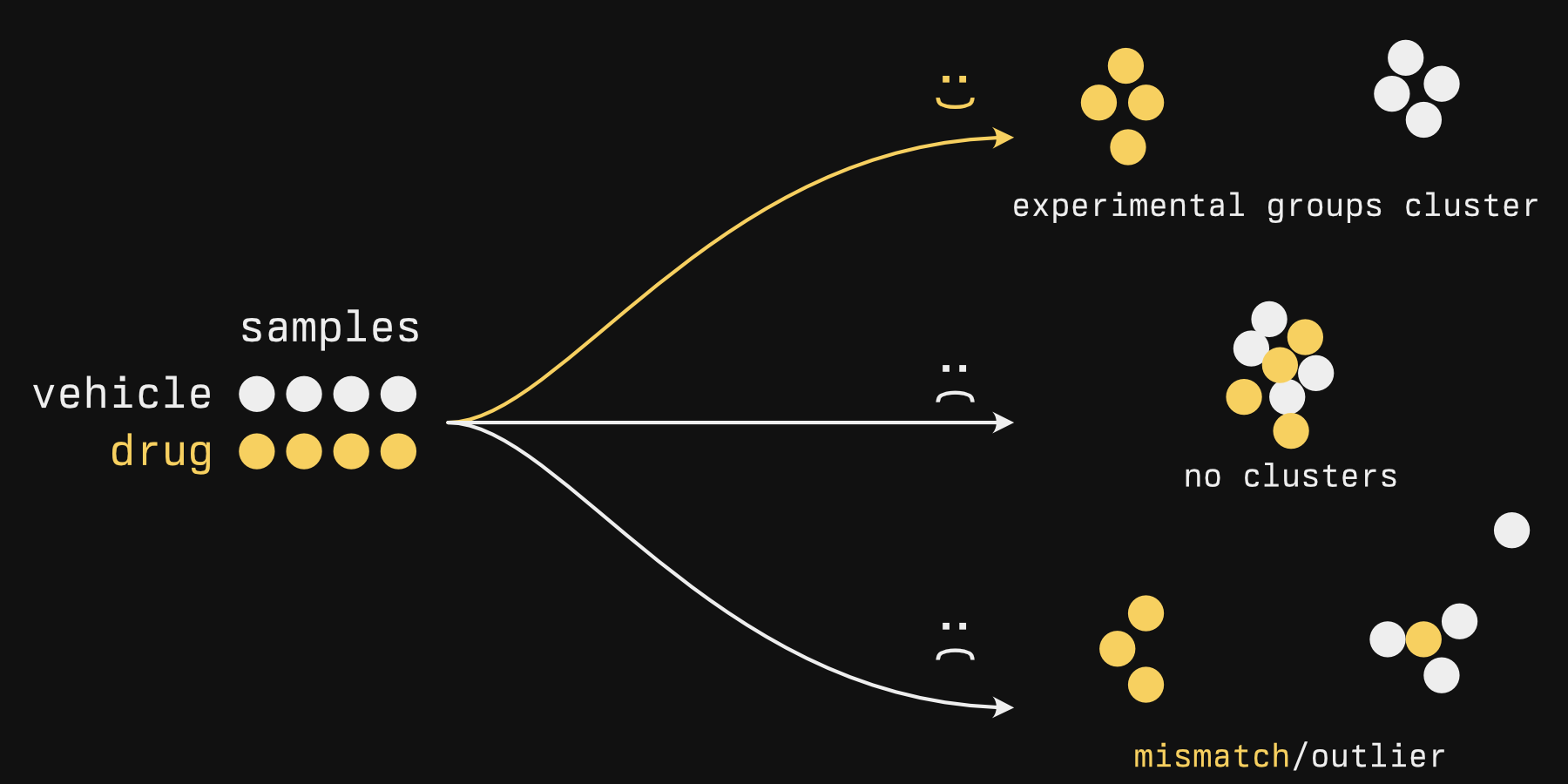
- Find groups de novo. One example that comes to mind is large patient tumor sequencing studies. In Sjödahl et al.'s "A Molecular Taxonomy for Urothelial Carcinoma", many bladder tumors were sequenced and clustered, and the authors determined there were 7 or so clusters (Figure 1) that exhibited different activity in biological processes (Figure 2) and were associated with different survival times (Figure 3). No clinical subtypes existed for bladder cancer (unlike breast cancer subtypes), so there were no labels to compare them against[1].
Hierarchical clustering is a type of unsupervised analysis, where 'unsupervised' means that it doesn't take any kind of labels into account, as we alluded to above.
In contrast, supervised analysis
Supervised analysis is also a thing, and unimportant to us right now. This is only if you are curious.
Supervised analytical methods tend to be less about clustering your data and more about using old data to predict something about new data. Importantly, they have some kind of value that the model will spit out: maybe it will say TRUE or FALSE if an image is a cat, maybe it will tell you the chance of rain in an hour if given the current weather information, position, etc. This is the typical 'machine learning' you'll hear about.
Typically, you feed a model a lot of data that has a known output value: Images where you know if there is a cat or not, historical weather data, etc. An algorithm 'learns' these patterns and applies its 'knowledge' on new data (like images where you don't know if there is a cat or not). It's 'supervised' because the algorithm is nudging itself to the best fit possible by seeing how well it can match the output value: really, it's supervising itself.
But it isn't magic nor sentient, despite the biological words like 'learning' being used. Literally a linear model can be considered machine learning. Fitting the line is it 'learning'. Your unknown input is an x value, and its output is the y value.
Hierarchical clustering is just one method of clustering. I like to use it because it's generally very easy to do and gives me quick and interpretable results, but just so you know, there are other methods (see this page from the Python package sci-kit learn for some nice visual comparisons). PCA, which we will discuss in the next chapter, allows you to see clusters - but isn't a clustering method.
→ How it works
Hierarchical clustering has two components:
- Some metric for determining how close one sample is to another
- An agglomeration strategy
The first step is easy and usually doesn't vary. The second step sounds strangely disgusting. We'll get to that.
Sample distance is usually euclidean: This is the distance that you and I typically measure, 'as the crow flies'. There are other measures of distance, but they aren't really used.
Below is an illustration of what happens during the second phase, the agglomeration. In this stage, individual samples form groups, one sample at a time, forming progressively larger blobs.
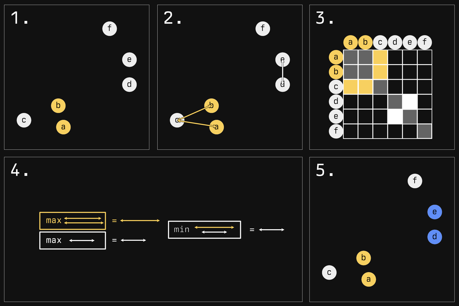
There are many strategies for determining who will blob next. The default strategy in R - and the one illustrated here - is called 'complete linkage'.
- Imagine we have some samples in a 2D plane. In reality, your samples will be in an N-D space, where 'N' is the number of genes you have expression data for. Rather tricky to visualize, but the concepts remain the same. The first step is very simple: the two nearest samples form a group. They're now the same color to show you that.
- Now we must make a choice: who gets globbed next? Should the yellow glob continue to grow? Or should a new group start instead? To answer this, in reality, we would look at all the comparisons between every sample (except for those within the same glob). Because that would mean a lot of arrows, I am choosing just a few pertinent examples.
-
Here is a representation of all the comparisons you would have to make (the whole grid, minus comparing
aandbsince they are in the same glob, and minus self comparisons). We are just focusing on the yellow and white sections. - For complete linkage, the next glob will be made as follows: Compare all the distances of a glob to its potential next member. We have two arrows for the yellow group, only one arrow for the white group (it's a group of one). Take the maximum of these distances. For the white group this is a bit silly because it's just a comparison of one. Then, take the minimum of these 'group maximums'. Here, the winner is the white group.
- This white group wins and globs onto another sample, making the blue group.
This strange 'minimum of maximums' tends to keep clusters compact: If their farthest bits stray too far away from their next member, they probably won't get added to the herd. If you kept going, you'd get something like this:
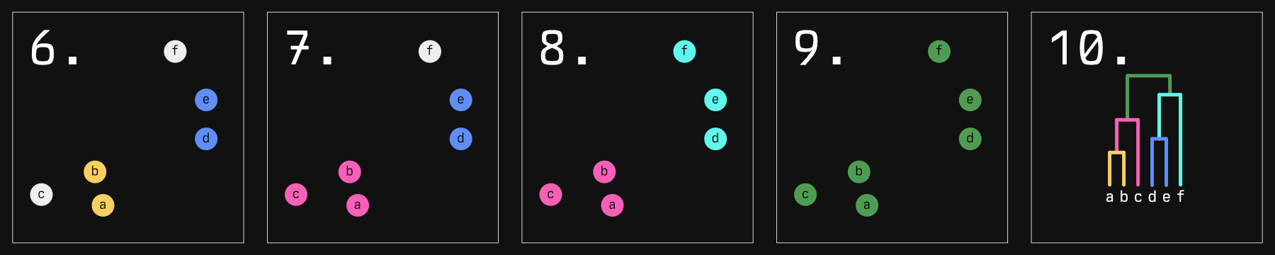
The dendrogram in the last panel is result you would expect. Not illustrated to scale here, but the distance between the horizontal 'grouping' lines represents how far apart each group is. In fact, that distance represents the length of the arrow that 'won' in our algorithm above.
This isn't the only agglomeration strategy though. 'Single linkage' is much more straightforward: it chooses the minimum of minimums, essentially always choosing the smallest distance in the matrix and joining those groups. This has a tendency to form long 'chains' of samples, which we will see reflected in our dendrograms.
From here you can define clusters by 'cutting' the tree, which is essentially taking a chainsaw and cutting a horizontal line at some height of the tree.
A word of warning: you will ALWAYS get clusters with hierarchical clustering, but whether they represent actual distinct, biologically significant populations is not assured. Therefore, cut if and only if there are relatively large distances between groups. Unfortunately, there is no 'magic distance' where a cut should or should not be considered. Silhouette scores can be used as a measure of cluster quality as well as how much a given sample 'belongs' to a given cluster.
We've talked long enough - let's make some plots.
→ Actually doing it
Making hierarchical clustering plots in R is delightfully straightforward. Making good (read: pretty) hierarchical plots is actually kind of a drag.
library(cellebrate)
library(DESeq2)
library(dendextend)
library(ggsci)
We're going to return to our favorite dataset, the RNAseq expression data from bladder cancer cell lines.
Our data should be normalized to account for size factors. If you have any batch
effects, you should correct for those here as well. To normalize, we'll use
DESeq2::vst. If you have <30 samples, you might use DESeq2::rlog instead.
The resultant expression values are logarithmic. If you come at this with some other form of expression somehow, you will want to take the log first.
norm <- vst(cell_rna)
norm_matrix <- assay(norm) # 'shuck' the DDS to get just the matrix
I haven't found a straight answer for if you should standardize (that is, turn in to z-scores) your log'd expression or not. It makes more sense to do so rather than not: with z-scores, you're clustering based on relative perturbations from normal for each gene, rather than absolute. So tentatively it is my recommendation to cluster using standardized data. We'll do it both ways to compare the difference, though.
For other kinds of data where your variables might have different scales,
z-scoring prior to distance measuring is imperative. Consider, for example, a
column named houses<sub>owned</sub> and another named salary<sub>usd</sub>. An increase or
decrease of 100 for a salary is nothing. An increase in 100 houses owned is
insane. Standardizing puts these values on a similar scale, where values measure
equivalent levels of 'surprise'.
First, you'll need to transpose your data (that is, rotate your data so that the columns become the rows and vice-versa).
This is done with the simple t function. How cute!
t_norm <- t(norm_matrix)
The reasons for this are two-fold:
-
scale- the thing we're going to use to standardize our expression data - works on a column-wise basis. In its current form, our data have samples in the columns, genes in the rows. We want to standardize each gene, not each sample. -
dist- even if you choose not to scale,distcompares the distance between rows. These rows will eventually become the 'leaves' of your dendrogram. Were you not to transpose, each leaf would be a gene. You will forget to do this, and you will remember once you go to plot it and see a big big mess of leaves after your computer hangs for a few terrible seconds.
The default distance metric is euclidean (this is the distance metric that we think of when we think distance. If it sounds simple, it's because it is), and I haven't found a logical reason to change this.
distance_unscaled <- dist(t_norm)
distance_scaled <- dist(scale(t_norm))
Now we perform the agglomeration (again, the method by default is 'complete linkage'):
hclust_unscaled <- hclust(distance_unscaled)
hclust_scaled <- hclust(distance_scaled)
And then we plot:
# Sets plot parameters to have space for two plots, side by side (1 row, 2
# columns)
par(mfrow = c(1, 2))
plot(hclust_unscaled)
plot(hclust_scaled)
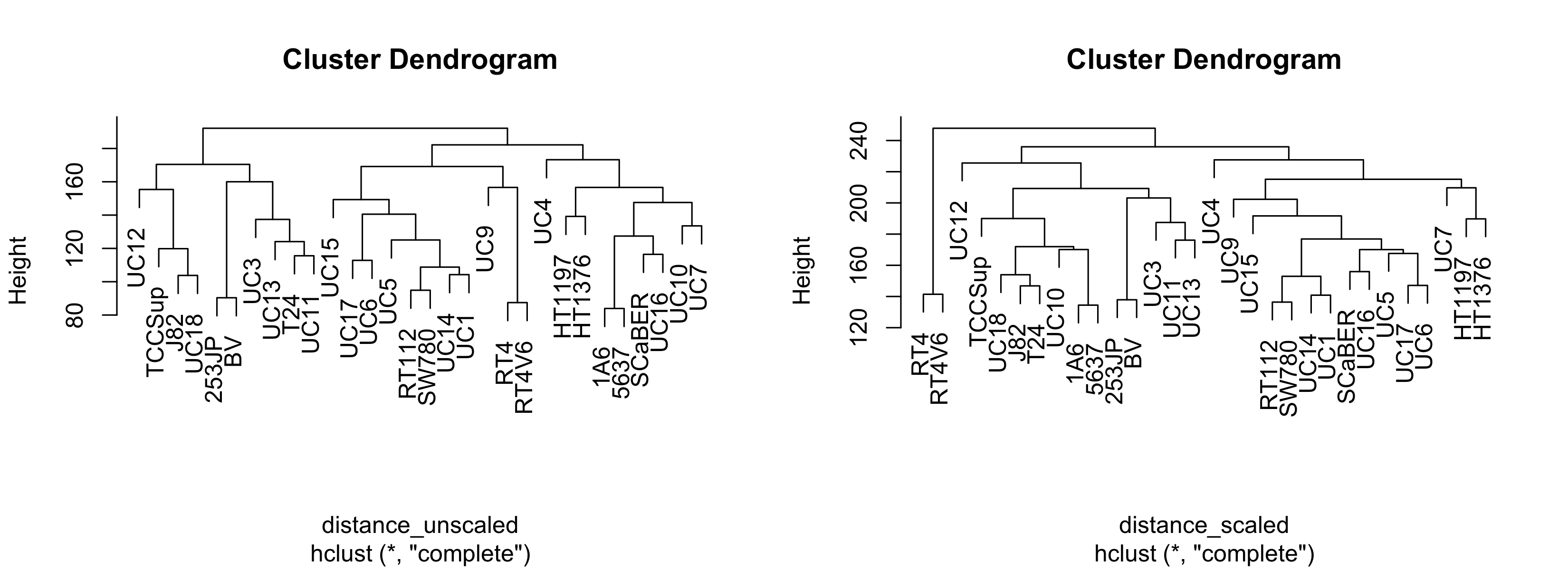
This is woefully nondescript - it's difficult to compare clustering methods unless you're familiar with the cell lines. It would be nice if we could overlay some other kind of variable such that each leaf label color corresponded with some other variable. We'll address this later. Just for now, notice that the general structure - the connectivity - is pretty similar. However, if we change the agglomeration method:
hclust_unscaled_single <- hclust(distance_unscaled, method = "single")
hclust_unscaled_average <- hclust(distance_unscaled, method = "average")

par(mfrow = c(1, 3))
plot(hclust_unscaled)
plot(hclust_unscaled_average)
plot(hclust_unscaled_single)
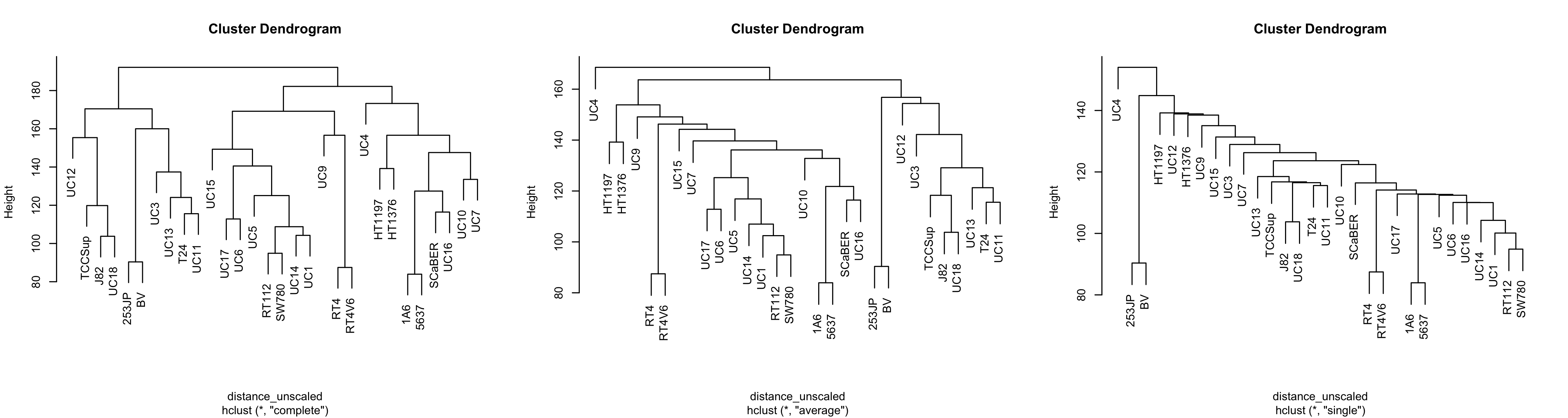
Note that with single linkage, the tree tends not to form groups so much as a chain of 'relatives'. This is less apparent in average linkage, and complete linkage seems to have more separate clusters.
On a personal basis, I think average linkage can make sense if you have few samples and don't expect clusters to be normal shaped. That's just vibes-based though, not backed up by statistical rigor. In general I don't think you can go wrong with complete linkage.
As you can tell, making hclust plots is, for once, simple. However, they are
terribly drab, and we could benefit with overlaying other variables on our
dendrogram to see how a given variable correlates with the clusters.
To this end, we're going to use the dendextend package. For a fuller
description, you can refer to the vignette here. The package is flexible but a
bit cumbersome in my opinion.
The first step is to get a palette of colors that contains as many colors as you have levels in whatever variable you want to plot. The variable I have has two levels: 'BSL' and 'LUM'
The gist of what you want to do is to get a vector of colors that map to each level of your variable. The tricky part is that you need them to be in the correct order: the order of the dendrogram.
Our approach will be as follows:
- Get the order of your labels (leaves of the dendrogram)
- Use that order to organize the labels
- Use those labels to organize your original dataset that has the variable of interest
- Extract your variable of interest (now in the right order)
- Choose some colors
- Convert your levels into colors
It's an arduous process for something that seems like it should be simple, I know. I'm sorry.
The label order and the labels are stored in your hclust object, but the
labels themselves are not ordered. This does steps 1 and 2:
ordered_labels <- hclust_unscaled$labels[hclust_unscaled$order]
ordered_labels
# [1] "UC12"   "TCCSup" "J82"    "UC18"   "253JP"  "BV"     "UC3"    "UC13"   "T24"    "UC11"   "UC15"
# [12] "UC17"   "UC6"    "UC5"    "RT112"  "SW780"  "UC14"   "UC1"    "UC9"    "RT4"    "RT4V6"  "UC4"
# [23] "HT1197" "HT1376" "1A6"    "5637"   "SCaBER" "UC16"   "UC10"   "UC7"
You'll note that the order of these labels matches the order of the labels in the leftmost panel of the figure above.
Now we need to arrange our experimental data (colData) to match:
Before arranging:
# col_data <- colData(cell_rna)
# col_data
# DataFrame with 30 rows and 5 columns
#               cell       bsl       lum        call             clade
#        <character> <numeric> <numeric> <character>          <factor>
# 1A6            1A6     98.98      1.02         BSL  Epithelial Other
# 253JP        253JP     76.58     23.42         BSL  Unknown
# 5637          5637     98.54      1.46         BSL  Epithelial Other
# BV              BV     49.94     50.06         LUM  Unknown
# HT1197      HT1197     56.02     43.98         BSL  Epithelial Other
# ...            ...       ...       ...         ...               ...
# UC4            UC4      0.06     99.94         LUM Unknown
# UC5            UC5      0.00    100.00         LUM Luminal Papillary
# UC6            UC6      0.04     99.96         LUM Luminal Papillary
# UC7            UC7      0.11     99.89         LUM Epithelial Other
# UC9            UC9      0.00    100.00         LUM Epithelial Other
To arrange the rows in the proper order, we're going to use the match
function, a useful but confusing function. It returns the order you should
shuffle things if you want the second argument to look like the first. I get the
order mixed up ALL THE TIME.
Step 3:
 col_data_order <- match(ordered_labels, col_data$cell)
 ordered_col_data <- col_data[col_data_order, ]
 ordered_col_data
# DataFrame with 30 rows and 5 columns
#               cell       bsl       lum        call            clade
#        <character> <numeric> <numeric> <character>         <factor>
# UC12          UC12      0.49     99.51         LUM      Mesenchymal
# TCCSup      TCCSup     99.90      0.10         BSL      Mesenchymal
# J82            J82     98.09      1.91         BSL      Mesenchymal
# UC18          UC18     99.60      0.40         BSL      Mesenchymal
# 253JP        253JP     76.58     23.42         BSL      Unknown
# ...            ...       ...       ...         ...              ...
# 5637          5637     98.54      1.46         BSL Epithelial Other
# SCaBER      SCaBER     99.89      0.11         BSL Epithelial Other
# UC16          UC16      1.54     98.46         LUM Epithelial Other
# UC10          UC10     39.73     60.27         LUM Epithelial Other
# UC7            UC7      0.11     99.89         LUM Epithelial Other
Now that it's in the correct order, we just extract the column we want (Step 4) - in this case, call:
ordered_variable <- ordered_col_data$call
ordered_variable
# [1] "LUM" "BSL" "BSL" "BSL" "BSL" "LUM" "BSL" "BSL" "BSL" "BSL" "BSL" "LUM" "LUM" "LUM" "LUM" "LUM"
# [17] "LUM" "LUM" "LUM" "LUM" "LUM" "LUM" "BSL" "LUM" "BSL" "BSL" "BSL" "LUM" "LUM" "LUM"
Step 5, we pick some colors. I just have BSL and LUM, so I only need two colors.
pal <- hcl.colors(2) # uses viridis by default.
# I find the top end tends to be a bit too bright, so let's make 10 and take the first and the eight:
pal <- hcl.colors(10)[c(1, 8)]
pal
# [1] "#4B0055" "#6CD05E"
These are your colors in hexidecimal format.
A word on colors
There are many ways to generate colors, but for publication you can't go wrong with viridis (https://bids.github.io/colormap/). Viridis is 'perceptually uniform' (that is, its spectrum doesn't have any distinguishable 'bands' like a rainbow does) and color-blind friendly. Even better, it still works in black and white.
Perceptual uniformity is important if you're using color to plot a continuous variable so that differences between numbers are reflected accurately by how they look. Palettes with sharp jumps in them might make it look like there are stark differences where there aren't, or no differences where there are.
We now need to convert the variable to colors. The easiest way to do that is to convert them to numbers, which we can then use to index our color palette.
This is better shown than described.
To convert the levels to numbers, we can do this strange little dance:
calls_as_num <- ordered_variable |> as.factor() |> as.numeric()
calls_as_num
# [1] 2 1 1 1 1 2 1 1 1 1 1 2 2 2 2 2 2 2 2 2 2 2 1 2 1 1 1 2 2 2
Now we uses these numbers to index our palette, which returns the color in the respective slot for each number:
colors_ordered <- pal[calls_as_num]
colors_ordered
# [1] "#6CD05E" "#4B0055" "#4B0055" "#4B0055" "#4B0055" "#6CD05E" "#4B0055" "#4B0055" "#4B0055" "#4B0055"
# [11] "#4B0055" "#6CD05E" "#6CD05E" "#6CD05E" "#6CD05E" "#6CD05E" "#6CD05E" "#6CD05E" "#6CD05E" "#6CD05E"
# [21] "#6CD05E" "#6CD05E" "#4B0055" "#6CD05E" "#4B0055" "#4B0055" "#4B0055" "#6CD05E" "#6CD05E" "#6CD05E"
Lastly, we use dendextend's labels<sub>colors</sub> function. It takes a dendrogram, though, not a hclust object, so we convert it just before:
dend <- as.dendrogram(hclust_unscaled)
labels_colors(dend) <- colors_ordered

plot(dend)
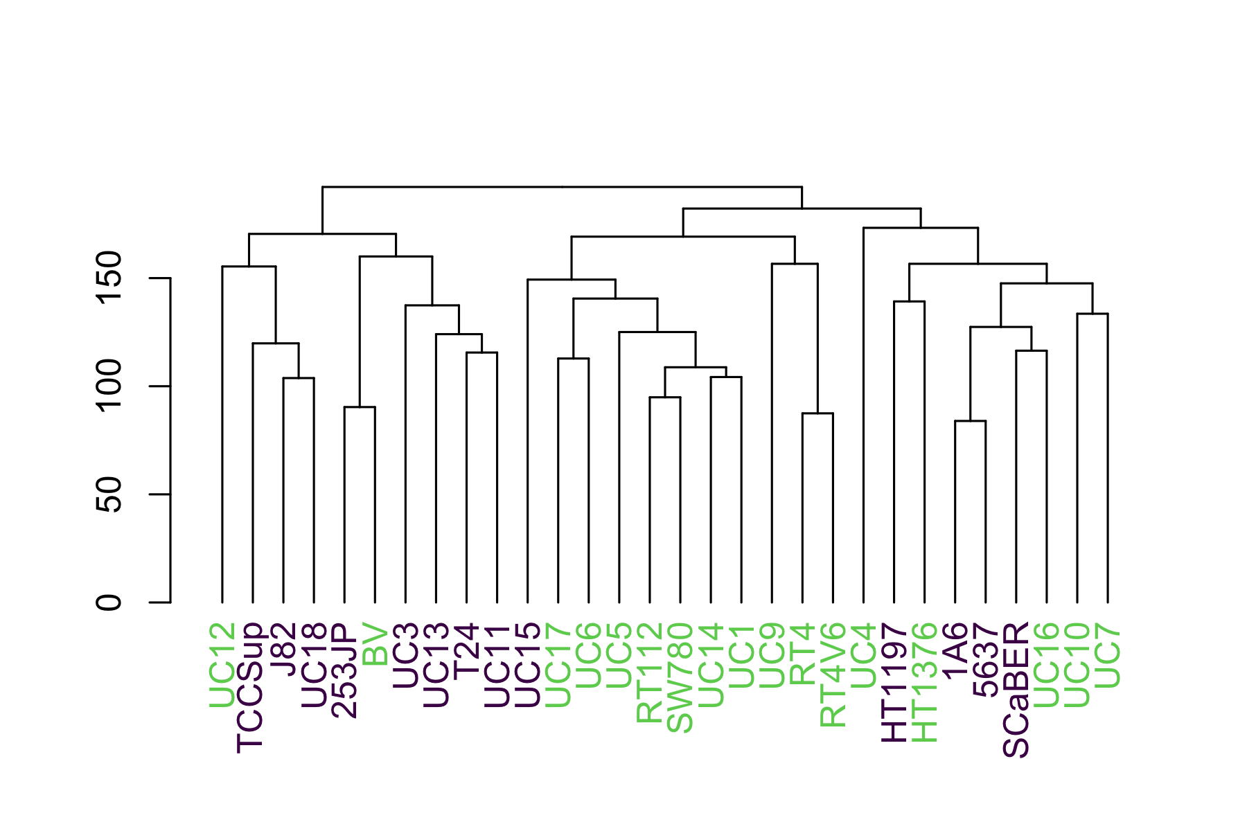
This shows us that they luminal (green) cells tend to sequester to the right side and the basal (purple) to the left.
Since we might want to apply this to multiple hclust objects with different variables, we can package it into a function:
make_plots_less_drab <- function(
  hclust,
  col_data,
  label_col = "cell",
  color_col = "call"
) {
  dend <- as.dendrogram(hclust)

  # Get as many colors from the nejm palette as there are unique values in
  # color_col

  # This palette isn't viridis - it's from ggsci. I find it performs a bit
  # better with categorical variables.
  pal <- pal_nejm()(length(unique(col_data[[color_col]])))

  color_col_as_numeric <- col_data[[color_col]] |>
    as.factor() |>
    as.numeric()

  # Match order of items as in the dendrogram
  sorted_color_col <- color_col_as_numeric[order.dendrogram(dend)]

  labels_colors(dend) <- pal[sorted_color_col]

  dend
}
Now we can easily make the same plots as before, but with the call variable overlaid:
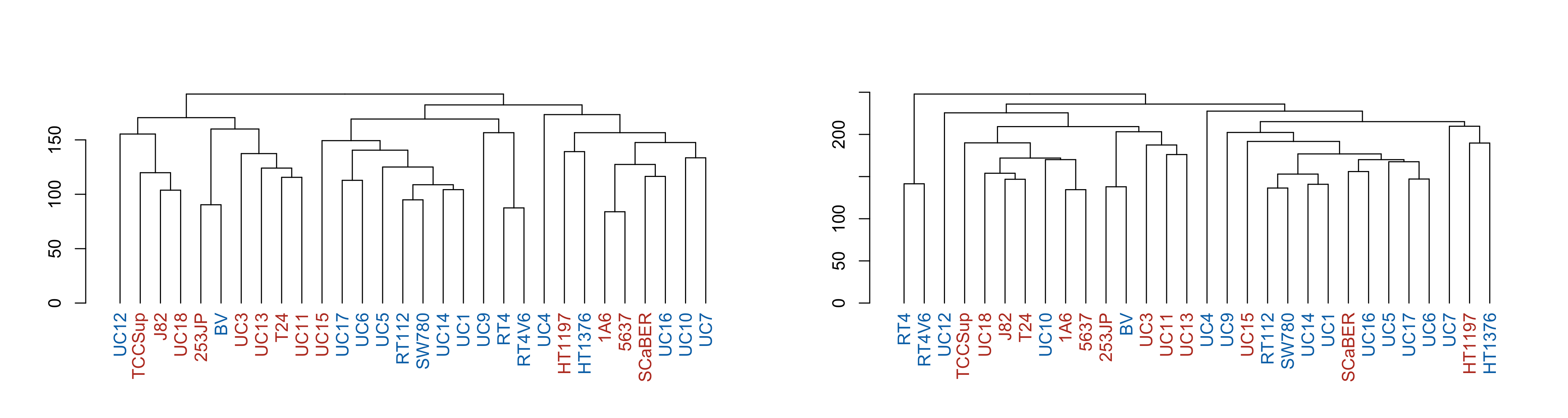
par(mfrow = c(1, 2))
p1 <- make_plots_less_drab(
  hclust_unscaled,
  colData(cell_rna),
  color_col = "call"
)
p2 <- make_plots_less_drab(
  hclust_scaled,
  colData(cell_rna),
  color_col = "call"
)
plot(p1)
plot(p2)
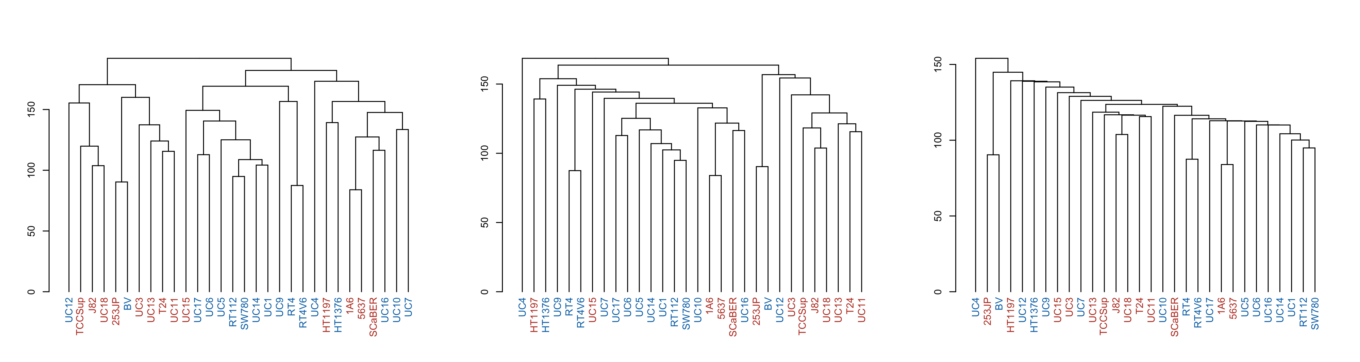
par(mfrow = c(1, 3))
p1 <- make_plots_less_drab(hclust_unscaled, colData(cell_rna))
p2 <- make_plots_less_drab(hclust_unscaled_average, colData(cell_rna))
p3 <- make_plots_less_drab(hclust_unscaled_single, colData(cell_rna))

plot(p1)
plot(p2)
plot(p3)
A final illustrative thing you can do when comparing dendrograms is a 'tanglegram', which helps compare the connectivity differences. I find it's particularly useful when the clades are colored so that you can tell if a given line changes clade membership - so I color the brances of the clades using color<sub>branches</sub>. Due to p2 having an outgroup (UC4) I have to give it 3 colors so the clades kinda match. Also, I had to finagle the order of the colors so they match too.
p1_colored <- color_branches(p1, k = 2, col = c("red", "blue"))
p2_colored <- color_branches(p2, k = 3, col = c("black", "blue", "red"))
tanglegram(p1_colored, p2_colored, sort = TRUE, edge.lwd = 0.5, margin_inner = 4)
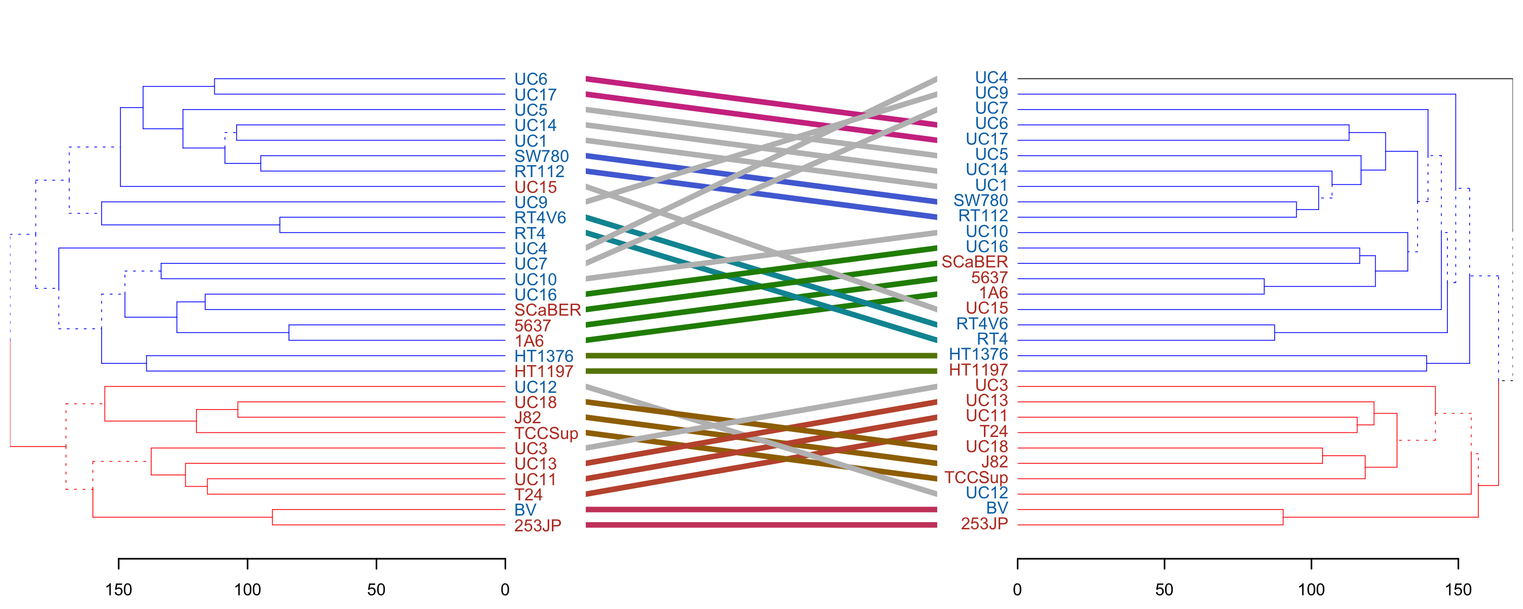
We see that clade membership remains largely unchanged between clustering methods (complete vs average) in this case.
→ References
- A worked example of complete-linkage. It's less visual but more exact, I'd highly recommend taking a peek.
-
This is in contrast to Perou et al.'s Molecular portraits of human breast tumours, breast cancer tumors were also sequenced and clustered, but they were able to compare them against pre-existing clinical subtypes. Both are equally valid approaches, both use unsupervised clustering. If you are lucky enough to have some kind of labels as Perou did, you can feel free to ignore them and proceed as Sjödahl did for a separate kind of analysis. But we're getting ahead of ourselves.
↩︎︎